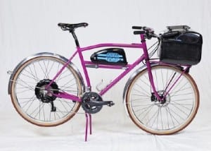
Pereira’s bike, painted fluorescent pink, took first place. It features an electric assist, which can boost a rider’s power, a lockable storage container, and a sound system that lets the rider pump music or NPR. This bike, Pereira told the judges, could replace a car for many Americans who are turned off by the idea of commuting by bike.
Although cycling is becoming increasingly popular around the United States, the number of people who commute by bike still make up a tiny minority. Oregon Manifest is a nonprofit that pushes bike design and innovation, and its challenge focuses on creating bikes that can serve the needs of a modern life. (This year marks the second time the group has staged the challenge; Pereira won the first one too.) Entries were judged on the innovation in function, materials, technology and adaptability, as well as on aesthetics and on functionality—their ability to perform well in the field test, a 50-mile ride on roads in and around Portland.
It was during the field test that Pereira first really appreciated the convenience of an electric assist. The assist doesn’t excuse the bike’s rider from pedaling. It just makes the work easier: “The harder you pedal, the more it helps you,” Pereira says. He had wanted to incorporate one into a bike for a few years and had been testing it out on rides around town. He had not used it for any real distances or long hills before this weekend, though.
“I was riding with a bunch of guys for the first 20 miles or so, and I didn’t use the assist at all,” he says. But when the group hit the first long hills, Pereira turned it on. “I turned around a minute or two later, and I couldn’t even see the other guys anymore,” he says. “I was still pedaling really hard. It just augmented my effort.”
In a city, though, the assist means that a rider could make a trip without pedaling as hard and arriving at a destination sweaty and unkempt. The storage container, a carbon-fiber box created for Pereira by Shawn Small and Graham Adams of the Portland-based Ruckus Components, was similarly intended to help cyclists blend in, instead of stand out.
“You can pick out a bike commuter a mile away,” Pereira says. “They have all this stuff with them.” The storage locker is meant to allow bikers to leave at least some of their gear with their bike while they run into the store or head into an office for a meeting.
But the bike is also intended to look cool. (And yes, it’s for sale, although before getting too attached, you should know that his last prize winner was listed for $6,900.) “A big part of what drives me as a builder are aesthetics,” Pereira says. “I want to bike to look really great.”
On some of the blogs that have featured his winning bike design, he’s read commenters complaining that they could achieve most of the same features by adding an electric assist to a touring or cyclocross bike. Sure, Pereira says, you can buy a bunch of extras and bolt them all into the bike. But “it’s going to look like a bunch of stuff bolted onto the bike,” he adds.